Form abandonment is the quiet killer of conversions: people start your form, then leave before submitting, and you never see the lead, the sale, or the signup. The good news is that most abandonment has identifiable causes and concrete fixes. This guide covers what form abandonment is, what a realistic rate looks like (with the honest caveat that it varies a lot), why people abandon, eight fixes that reliably help, and how to measure and track abandonment so you know which fix to make. The figures here are attributed to published research, not invented, because the point is to help you improve, not to impress you with a number.
What Is Form Abandonment
Form abandonment is when someone begins filling out a form, interacts with at least one field, then leaves without submitting. It's distinct from a bounce, where a visitor leaves without engaging at all: abandonment means they started and gave up, which is both more frustrating (they were interested) and more fixable (you can see where they stopped).
It's worth being clear this article is about web and online form abandonment, the UX and analytics sense, not the legal sense (a "notice of abandonment" or an abandoned trademark or application, which share the phrase but are unrelated). For a web form, abandonment is the gap between starts and submissions: of everyone who began the form, the share who didn't finish. Reducing it means closing that gap, getting more of the people who started to actually submit, and the rest of this guide is how.
One practical implication of that definition: abandonment is a signal, not just a loss. Because the person started, their drop-off tells you something specific, the form asked too much, hit a snag, or lost their trust at a particular point. A bounce gives you almost nothing to act on; an abandonment, especially when you can see where it happened, is a pointer to the exact thing to fix. Treating abandonment as diagnostic rather than simply disappointing is the mindset that makes the rest of this guide useful.
What's a Typical Form Abandonment Rate
There's no single "normal" rate, it depends heavily on the form type, length, and context, so treat any benchmark as rough orientation rather than a target. With that caveat firmly in place, published research gives useful reference points. The most-cited figure comes from checkout flows: Baymard Institute's ongoing research puts the average online shopping-cart abandonment rate at around 70 percent, with a meaningful share of that driven by the checkout form itself. In their checkout research, a notable portion of abandoners cite a checkout that's too long or complicated as a reason for leaving.
The honest takeaway isn't a number to hit; it's that abandonment is normal and often high, especially on longer or higher-friction forms, and that form design materially affects it. A short newsletter signup will abandon far less than a long insurance quote. Rather than chasing someone else's benchmark, measure your own form's starts-versus-submissions, then work to improve that, your baseline and your trend matter more than an industry average measured on different forms.
A useful way to frame your own number: rather than ask whether 60 percent is good or bad, ask whether your form is better or worse than it was last month, and which change moved it. An abandonment rate in isolation is almost meaningless without the form's type and context; the same 50 percent is excellent for a long application and poor for a two-field signup. So anchor on your own trend line, and use benchmarks only to sanity-check that you're in a plausible range, not as a goal to hit.
Why Users Abandon Forms
Abandonment has a handful of recurring causes, and naming them tells you what to fix.
Length and field count. The biggest lever. Every extra field is another chance to give up, and Baymard's research on checkout form fields found the average checkout shows around 11.3 form fields when roughly 8 would do, unnecessary fields directly cost completions. Friction and effort. Anything that makes the form feel like work, confusing labels, unexpected questions, fiddly inputs, pushes people out. Trust concerns. Asking for sensitive information (phone, payment, personal data) without visible reassurance makes people hesitate, then leave. Mobile problems. Tiny tap targets, the wrong keyboard, zoom-and-scroll layouts, mobile users abandon more when the form fights them. Errors and validation. A form that rejects input unclearly, or only reveals errors after a failed submit, frustrates people into quitting. Nielsen Norman Group's web form design guidance covers the usability side of most of these. Almost every fix in the next section maps to one of these causes.
It's worth ranking these for your own form rather than treating them equally. For most forms, length is the dominant cause and the first thing to address; trust matters most when you ask for sensitive data; mobile dominates if most of your traffic is on phones. Diagnosing which cause is biggest for you, ideally with data rather than assumption, stops you from polishing the wrong thing while the real problem goes untouched.
How to Reduce Form Abandonment: 8 Fixes
Here are eight fixes that reliably reduce abandonment, each targeting one of the causes above. Start with the first, it's almost always the highest-impact.
| Fix | Why it reduces abandonment |
|---|---|
| Ask for fewer fields | Every field is a chance to quit; cut anything non-essential |
| Use a single-column layout | A clear top-to-bottom path is easier to follow than multi-column |
| Add smart defaults | Pre-filled sensible values mean less typing and fewer decisions |
| Validate inline | Catch errors at the field, the moment they happen, not after a failed submit |
| Show trust signals | Privacy notes and security cues reassure people sharing sensitive data |
| Optimise for mobile | Large tap targets and the right keyboard per field cut mobile friction |
| Split long forms into steps | A few fields at a time feels far less daunting than one long page |
| Offer save-and-continue | Let people pause and return instead of losing progress and giving up |
A little more on the highest-leverage ones. Fewer fields is the single best place to start: go through your form and cut or make optional anything you don't strictly need, every removal lifts completion. Inline validation matters more than people expect, because validating each field as it's completed (rather than dumping all errors after submit) prevents the frustrating dead-end that makes people leave. For longer forms, splitting into steps with multi-step structure and offering save-and-continue both tackle the length problem directly, the first by making the form feel shorter, the second by removing the all-or-nothing pressure. And using conditional logic to show only the fields relevant to each person keeps the form as short as it can be for everyone. None of these is exotic; together they address the causes that drive most abandonment.
Two fixes deserve a word on how to apply them well. Trust signals work best placed exactly where the hesitation happens, a short note next to the phone or payment field explaining why you need it and how it's protected does more than a generic privacy badge in the footer. And mobile optimisation is less about a separate design than about details: the right input type per field (so the numeric keypad appears for a phone number), tap targets big enough for thumbs, and no horizontal scrolling. Both are small changes with outsized effects, because they remove friction at the precise moment someone might otherwise quit.
How to Measure and Track Form Abandonment
You can't improve what you don't measure, and abandonment is measurable with a simple funnel: views → starts → submissions. Views is how many people saw the form; starts is how many began filling it in; submissions is how many finished. Your completion rate is submissions ÷ views (or ÷ starts, depending on what you're optimising), and your abandonment is the inverse, the people who entered the funnel but didn't come out.
Watching this over time is what makes it actionable. A drop in completion rate after a change tells you the change hurt; a rise tells you it helped. The basics, total submissions, trends over time, and a view-to-completion rate, are enough to know whether abandonment is getting better or worse and to A/B-test fixes. The next level, knowing exactly which field people abandon on, needs field-level analytics, covered next. Measuring honestly also means not over-claiming: tracking completions against views tells you the rate and the trend, but it isn't the same as watching individual sessions keystroke by keystroke, which is a different (and more invasive) kind of tooling.
A simple cadence works: check the completion rate weekly, make one change at a time, and watch whether the rate moves over the following week or two. Changing several things at once muddies which one helped, so isolate fixes when you can. And give each change enough traffic to judge, a rate that swings on ten submissions is noise; one that holds across a few hundred is signal. Patience and one-change-at-a-time turn the funnel from a vanity number into a real optimisation tool.
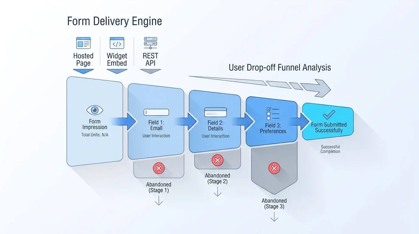
Field-Level Form Abandonment: Finding the Drop-off Field
The overall rate tells you whether you have a problem; field-level analytics tells you where it is. A completion funnel that breaks the form down, showing how many people reach and pass each field or step, reveals the exact point where people give up. If 80 percent of abandoners stop at the phone-number field, that field is your problem, and you can act: make it optional, explain why you need it, or remove it.
This kind of field-level and funnel analysis is more advanced than the basic overview, and in most tools (including Forms Expert, where per-field analytics, the completion funnel, and device or location breakdowns sit on the Pro tier and above) it's a higher-plan feature, worth knowing before you assume it's available everywhere. The payoff is precision: instead of guessing which of the eight fixes to apply, you see the specific field or step driving the drop-off and fix that one. It turns abandonment from a vague problem into a targeted one. For more on the metrics worth tracking beyond raw counts, see our guide to form analytics beyond counts.
A caveat on interpreting a drop-off field: the field where people leave isn't always the field at fault. Sometimes a confusing field two steps earlier plants the doubt that surfaces as an exit later, and sometimes people leave at a natural pause (like a payment step) for reasons unrelated to the field itself. So use field-level data as a strong hint about where to look, then check the field and the ones before it, rather than assuming the exit point is automatically the culprit. The data narrows the search; your judgement closes it.
Reduce Form Abandonment in Forms Expert
Forms Expert gives you both the fixes and the measurement, with an honest split between what's on every plan and what's higher up. On the building side, the fixes above are all available: keep forms short, use conditional logic and multi-step to cut perceived length, offer save-and-continue on long forms, and rely on a clean, mobile-friendly, single-column render.
On the measurement side, every plan gets the basic analytics overview, total submissions, today/week/month, status breakdown, read and spam rate, a submission-trends chart, and view tracking that gives you a completion rate, which is enough to see whether abandonment is improving. The deeper diagnosis, per-field analytics, the completion funnel (views → submissions → percentage), peak-hours, and device or geo cuts, is on the Pro tier and above; that's the layer that pinpoints the exact drop-off field. One more thing that helps indirectly: because Forms Expert uses flat pricing rather than per-response billing, you're never penalised for a high-traffic form while you're optimising it, more starts don't mean a bigger bill.
That matters more than it sounds during optimisation: reducing abandonment usually means driving more traffic to the form to test changes, and a per-response pricing model would tax exactly the experimentation that improves your results. Flat pricing keeps the incentive clean, optimise freely, measure the effect, and keep the wins. See the form analytics page for the measurement side in detail.
Frequently Asked Questions
What is form abandonment?
Form abandonment is when someone starts filling out a form, interacting with at least one field, then leaves without submitting it. It's different from a bounce, where a visitor leaves without engaging at all: abandonment means the person was interested enough to begin but gave up before finishing. For a web form, it's measured as the gap between starts and submissions, of everyone who began the form, the share who didn't complete it. It's both frustrating and fixable: frustrating because those people wanted what you offered, and fixable because you can usually identify where and why they stopped and address it. (Note this is the UX sense of the term, not the legal notice-of-abandonment meaning.)
What is the average form abandonment rate?
There's no single average, it depends heavily on the form's type, length, and context, so treat any benchmark as rough orientation, not a target. The most-cited reference point comes from e-commerce: Baymard Institute's research puts the average online shopping-cart abandonment rate at around 70 percent, with a significant portion attributed to the checkout form being too long or complicated. Web forms generally see high abandonment, and longer or higher-friction forms see more. Rather than chasing an industry figure measured on different forms, the useful approach is to measure your own form's starts-versus-submissions and work to improve that baseline and trend over time, which is what actually moves your results.
Why do users abandon forms?
A handful of recurring causes account for most abandonment. Length and field count is the biggest, every extra field is another chance to give up, and research shows many forms ask for more than they need. Friction and effort (confusing labels, unexpected questions, fiddly inputs) push people out. Trust concerns make people hesitate when a form asks for sensitive data without visible reassurance. Mobile problems, tiny tap targets, the wrong keyboard, awkward layouts, drive higher abandonment on phones. And unclear errors or validation that only appears after a failed submit frustrates people into quitting. Almost every effective fix maps back to one of these causes, so identifying which applies to your form tells you what to change first.
How do you reduce form abandonment?
Target the common causes with concrete fixes. The highest-impact is usually to ask for fewer fields, cut or make optional anything non-essential. Then: use a single-column layout for a clear path; add smart defaults to reduce typing; validate inline so errors are caught at the field rather than after submit; show trust signals when asking for sensitive data; optimise for mobile with large tap targets and the right keyboards; split long forms into steps so they feel shorter; and offer save-and-continue so people can pause without losing progress. Start with fewer fields, then measure the effect and add the next fix. Each one addresses a specific reason people leave, so the gains compound.
How do you measure and track form abandonment?
Use a simple funnel: views, then starts, then submissions. Views is how many saw the form, starts is how many began it, and submissions is how many finished. Your completion rate is submissions divided by views (or by starts), and abandonment is the inverse, those who entered but didn't finish. Track this over time so you can tell whether a change helped or hurt: a rising completion rate means a fix worked, a falling one means it didn't. The basics (totals, trends, and a view-to-completion rate) are enough to A/B-test fixes. To find the exact field people abandon on, you need field-level or completion-funnel analytics, which is typically a more advanced, higher-plan feature.
Which form fields cause the most drop-off?
It varies by form, which is exactly why field-level analytics is valuable, it shows you your form's specific problem field rather than a generic answer. That said, certain fields are common culprits: phone number (people are reluctant to give it), anything that feels intrusive or unexpected, fields requiring effort to look up (account numbers, references), and poorly handled required fields that block progress. A completion funnel that shows how many people reach and pass each field pinpoints the drop-off precisely: if most abandoners stop at one field, that's where to act, by making it optional, explaining why you need it, or removing it. Without field-level data you're guessing; with it, you fix the right field.
How does form length affect abandonment?
Strongly, length is one of the biggest drivers of abandonment. Every additional field adds effort and another point at which someone can decide it's not worth it, and research consistently finds that forms often ask for more than they need, with the excess directly costing completions. The practical implications: cut every field you don't strictly require, make genuinely optional ones optional, and use conditional logic so people only see fields relevant to them. For forms that are unavoidably long (applications, detailed quotes), splitting them into multiple steps makes them feel shorter and more manageable, and offering save-and-continue removes the pressure to finish in one sitting. Shortening the form, in reality or in perceived effort, is usually the most reliable way to reduce abandonment.
How quickly can you reduce form abandonment?
It depends on the fix, but some changes pay off immediately. Removing unnecessary fields or fixing a broken mobile layout can lift completion as soon as the change is live, because they remove friction every visitor hits. Others, like adding multi-step structure or save-and-continue, help most on longer forms and show up in the data over the following weeks as more people reach the end. The realistic approach is iterative: make one high-impact change (usually cutting fields), measure the effect over a week or two, then make the next. There's no single overnight fix, but a steady cadence of measured changes reliably brings the rate down, and the early wins from shortening the form are often the largest.