A long form is intimidating. Faced with twenty fields on one screen, a lot of people take one look and leave. A multi-step form fixes that by showing the same questions a few at a time, across several steps with a progress indicator, so the form feels manageable instead of overwhelming. This guide covers what a multi-step form is, the honest reasons it tends to convert better, how to build one with no code or in code, the best practices (including accessibility), and a set of real-world examples you can borrow. The aim is a complete, practical reference, not a sales pitch.
What Is a Multi-Step Form
A multi-step form (also called a multi-page or wizard form) is a single form split across multiple steps, with only a few related fields shown at a time and a progress indicator that tells people where they are. Instead of scrolling through one long page, the respondent answers a small group of questions, clicks next, and moves to the following step, often with the option to go back.
The key parts are a sequence of steps, a way to move forward and back, validation on each step (so errors are caught before moving on), and a visible progress cue such as Step 2 of 4 or a progress bar. It's worth distinguishing the layout from the logic: a multi-step form is about how a form is paginated, whereas conditional logic is about which fields or steps appear based on earlier answers. The two pair well but aren't the same thing, and we cover how they work together in our guide to conditional logic and multi-step forms. This article focuses on the multi-step layout itself, why it helps, how to build it, and how to design it well.
One more clarification, since the terms get muddled: a multi-step form is still a single submission. The respondent moves through steps, but they're filling in one form, and you receive one complete record at the end, not separate submissions per step. The pagination is purely a presentation choice; the underlying form, and the data you get, is unified. That's what separates a multi-step form from a sequence of linked, separate forms.
Why Multi-Step Forms Convert Better
It's tempting to quote a precise conversion-lift percentage here, but those numbers vary wildly by form, audience, and design, and a made-up figure helps no one. What's well understood is the mechanism, the reasons a multi-step form tends to outperform a long single page when it's done well.
Reduced perceived effort. A short first step looks easy, and easy invites a start. The same questions feel lighter spread across steps than stacked on one daunting page, even though the total work is identical. Progress feedback. A visible Step X of N or a progress bar gives a sense of momentum and a reason to finish, people don't like abandoning something they're most of the way through. Early, easy wins build commitment. Asking the simplest question first (an email, a name, a single choice) earns a small commitment that makes people more likely to continue, a well-documented effect in behavioural research. Focus. Fewer fields on screen means less cognitive load and fewer chances to get distracted or intimidated.
The honest caveat: multi-step isn't automatically better. Splitting a genuinely short form into steps just adds clicks for no benefit, and a clumsy implementation (no back button, lost data, unclear progress) can hurt. The lift comes from the design, not the format alone, which is what the best practices below are about.
It's also worth naming who benefits most. Multi-step pays off most clearly on longer or higher-friction forms, applications, detailed quote requests, registrations with payment, where a single page would be genuinely daunting. On a three-field newsletter signup it adds nothing and may even slow people down with an extra click. So the question isn't whether multi-step is better in the abstract, but whether your form is long or demanding enough to benefit from being broken up. The longer and more intimidating the form, the more the format helps.
How to Build a Multi-Step Form (No-Code)
With a form builder, building a multi-step form is a matter of configuration, not coding. The general process is the same across tools.
First, group your fields into logical steps, related questions together, simplest first. A registration form might be: basic details, then preferences, then payment. Second, add a step break between each group (in a good builder this is a single action that turns a long form into a paged one). Third, enable a progress indicator so respondents see how many steps remain. Fourth, turn on per-step validation so required fields are checked before someone can advance, catching errors early rather than at the very end. Fifth, allow back navigation so people can fix an earlier answer without losing their place. Finally, test the flow end to end on mobile and desktop, the experience of moving between steps is where multi-step forms succeed or fail.
The whole point of the no-code route is that the builder handles the step state, validation, and progress UI for you, so you spend your time on the field grouping and wording rather than on the plumbing. If your form is long, also consider letting people save and return, covered below.
A practical tip on grouping: a good test is whether you can give each step a short, honest title, Your details, Your project, Payment. If a step resists a clean label, it's probably mixing unrelated questions and should be regrouped. Titles also double as the progress labels respondents see, so getting the grouping right improves both the structure and the experience at once. Spend your effort here; it's the decision that most affects how the finished form feels.
How to Build a Multi-Step Form in Code
If you're building a form by hand, the core idea is simple: render all the steps, then show only one at a time and move between them. Here's the minimal pattern in plain JavaScript:
That's the skeleton: a set of step containers, an index for the current step, and next/back functions that move it. In a real build you'd add per-step validation inside next() (don't advance if required fields are empty), update a progress indicator, and persist answers so a refresh doesn't wipe them. Use semantic grouping, a <fieldset> with a <legend> per step, so the structure is meaningful to assistive technology; MDN's first form tutorial and W3C WAI's grouping controls cover the markup.
In a framework like React, the same pattern becomes a step piece of state and an array of step components, with the form data lifted into a parent so it survives navigation between steps. The principle is identical; only the state management changes. Building it yourself gives full control, at the cost of handling validation, progress, persistence, and accessibility yourself, which is exactly what a hosted builder does for you.
A note on data persistence specifically, because it's the part hand-built multi-step forms most often get wrong: if your steps live in separate sections but share one form, the browser keeps the values as people navigate; but if you re-render steps (as frameworks do), you must lift the form state up so answers aren't lost on each transition. Losing a respondent's earlier answers when they hit back is the fastest way to make a multi-step form worse than a single page.
Multi-Step Form Best Practices
The format only helps if the design is right. A handful of practices make the difference.
Group steps logically. Each step should be a coherent set, contact details, then preferences, then payment, not an arbitrary slice of a long list. The grouping should make sense to the person filling it in. Show clear progress. A Step X of N label or a progress bar is essential, it's the feedback that keeps people moving. Don't hide how many steps remain. Lead with the easiest step. Put the simplest, lowest-friction question first to earn the initial commitment, save the demanding fields for once people are invested. Always allow back navigation. People misremember or mistype; let them go back and fix it without losing data. Validate per step. Catch errors as they happen, not in a frustrating pile at the end. Keep steps short. A few fields each; if a single step is still long, that's a sign to split it further or rethink what you're asking.
Make it accessible. Multi-step forms have specific accessibility needs: a programmatically exposed progress state, properly labelled steps, working back navigation, and no surprise time limits. The W3C WAI multi-page forms tutorial is the authority here, follow it so screen-reader and keyboard users get the same clear experience as everyone else. And for long forms, let people save and continue later so they're not forced to finish in one sitting.
Two smaller touches that pay off: preserve answers if someone navigates away and returns within a session, and on important forms add a final review step so people can confirm before submitting. Both reduce the anxiety of a longer form, the sense that a mistake is irreversible or that progress is fragile. Multi-step forms win on the feeling of being in control, and these details are what create it.
Multi-Step Form Examples and Design Patterns
The best way to design a multi-step form is to borrow a proven pattern and adapt it. Here are common ones and why the multi-step layout suits each.
| Use case | Typical steps | Why multi-step helps |
|---|---|---|
| Lead capture | Contact → needs → budget | An easy first step (email) earns commitment before harder qualifying questions |
| Event registration | Attendee → tickets → payment | Groups related fields; payment feels lighter once the rest is done |
| Quote request | Project type → details → contact | Each step shows only the fields relevant to the choices so far |
| Job application | Role → experience → documents → review | A long application feels manageable; the file upload sits on its own step |
| Onboarding survey | Profile → preferences → goals | Progress feedback keeps people moving through many questions |
A few design notes that apply across these patterns. Keep the number of steps honest to the content, three to five is common, and more is fine if each step stays short, but don't manufacture steps just to look thorough. Put anything that needs focus or effort (a file upload, a payment, a long free-text answer) on its own step so it doesn't crowd other fields. And end with a brief review or confirmation step on important forms, so people can check their answers before submitting. The examples above are starting points; the right structure is whichever grouping makes your specific form feel shortest.
When you're sketching your own, work backwards from the submit button: what's the minimum you genuinely need, and what can wait? Front-load the low-friction, must-have fields and push the optional or demanding ones later, so even a partial completion captures something useful. Designing the step order around commitment, not just topic, is what separates a multi-step form that converts from one that merely paginates.
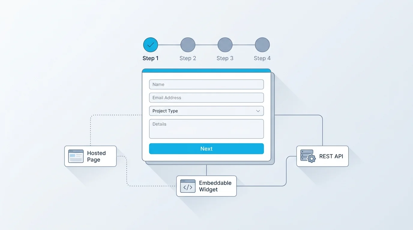
Build a Multi-Step Form in Forms Expert
In Forms Expert, multi-step is built in and available on every plan, including the free tier, it isn't a paid-only upgrade. You group fields into steps in the editor, and the hosted renderer handles the rest: a progress stepper (shown as a bar, dots, or numbered steps), step numbers, back navigation, and per-step validation that checks required fields before letting someone advance.
Because it's part of the standard form builder, a multi-step form is also still one form delivered three ways, a hosted page, an embed, and an API, with no separate setup. For long forms, you can pair multi-step with save and continue so people can leave and return without losing progress, and combine it with conditional logic to show only the steps that apply. It fits naturally with registration forms and other longer flows where breaking the form into steps is exactly what lifts completion. To try it, start from the home page and split your next long form into a few focused steps.
And because it's included on the free plan, you can test whether multi-step actually lifts completion for your form before committing to anything, the honest way to find out is to try it on your real audience rather than trust a generic statistic. That test-it-on-your-own-form approach is the theme of this whole guide: the multi-step format is a reliable tool, but the result depends on the grouping, the progress feedback, and the wording. Get those right and a long form stops feeling long, which is the entire point.
Frequently Asked Questions
What is a multi-step form?
A multi-step form, sometimes called a multi-page or wizard form, is a single form split across several steps, showing only a few related fields at a time with a progress indicator. Rather than presenting one long page, it walks the respondent through small groups of questions, with next and back navigation and validation on each step. The purpose is to make a longer form feel manageable: a few fields at a time is far less intimidating than twenty at once, even though the total amount of information is the same. Common examples include registrations, applications, and quote requests, anywhere a form would otherwise be a daunting single page.
Do multi-step forms convert better than single-page forms?
Often, yes, when they're well designed, though the size of the effect varies too much by form and audience to put an honest single number on it. The reasons are well understood: a short first step reduces perceived effort and invites a start; a visible progress indicator gives momentum and a reason to finish; leading with an easy question earns an early commitment that makes people more likely to continue; and fewer fields on screen lowers cognitive load. The caveat is that the format isn't magic, splitting an already-short form just adds clicks, and a poor implementation (no back button, lost data) can hurt. The lift comes from good design, not the multi-step label alone.
How do I create a multi-step form without coding?
Use a form builder that supports steps. The process is: group your fields into logical steps (related questions together, simplest first), add a step break between each group, enable a progress indicator, turn on per-step validation so required fields are checked before advancing, and allow back navigation so people can fix earlier answers. Then test the flow on both mobile and desktop. A good builder handles the step state, validation, and progress UI for you, so your work is the field grouping and wording rather than any code. In Forms Expert, multi-step is available on every plan, including the free tier, so you can build one without upgrading.
What are the best multi-step form tools?
The best tool depends on what else you need, since multi-step support is fairly common now. Look for a builder that offers a clear progress stepper, per-step validation, back navigation, and (for long forms) a save-and-continue option, then weigh the usual factors: pricing model, how the form is delivered (hosted, embed, or API), and whether multi-step is included on the plan you'd use rather than locked behind a higher tier. Many form builders include multi-step; Forms Expert, for example, offers it on every plan including the free one. For a broader comparison of form builders, see our guide to the best form builders, then check that multi-step is included where you need it.
How many steps should a multi-step form have?
Enough to keep each step short, but no more than the content honestly needs, three to five steps is a common, comfortable range. The goal is for every step to feel quick, so group related fields together and aim for a handful of fields per step. If a single step is still long, split it further; if you find yourself with one field per step across many steps, you've gone too far and are just adding clicks. Let the content set the number: a short form may need only two steps, while a detailed application might warrant five or six, as long as each one stays focused and brief.
How do I make a multi-step form accessible?
Multi-step forms have specific accessibility requirements beyond a normal form. Expose the progress state programmatically so screen-reader users know which step they're on and how many remain; label each step clearly; group each step's fields with a fieldset and legend so the structure is meaningful to assistive technology; ensure back navigation works by keyboard and doesn't lose data; and avoid surprise time limits that could cut people off mid-form. The W3C WAI multi-page forms tutorial is the authoritative reference and worth following closely. Getting this right means keyboard and screen-reader users get the same clear, recoverable experience as everyone else, which is both the right thing to do and often a legal requirement.
What's the difference between a multi-step form and conditional logic?
They're related but distinct. A multi-step form is about layout, how the form is paginated, splitting fields across steps so people see a few at a time. Conditional logic is about behaviour, which fields or steps appear based on earlier answers, so the form adapts to each respondent. You can have a multi-step form with no logic (fixed steps everyone sees) or logic on a single-page form (fields that appear when relevant), and they're especially powerful together: showing only the steps that apply to a given person. We cover how the two combine in our dedicated guide to conditional logic and multi-step forms.