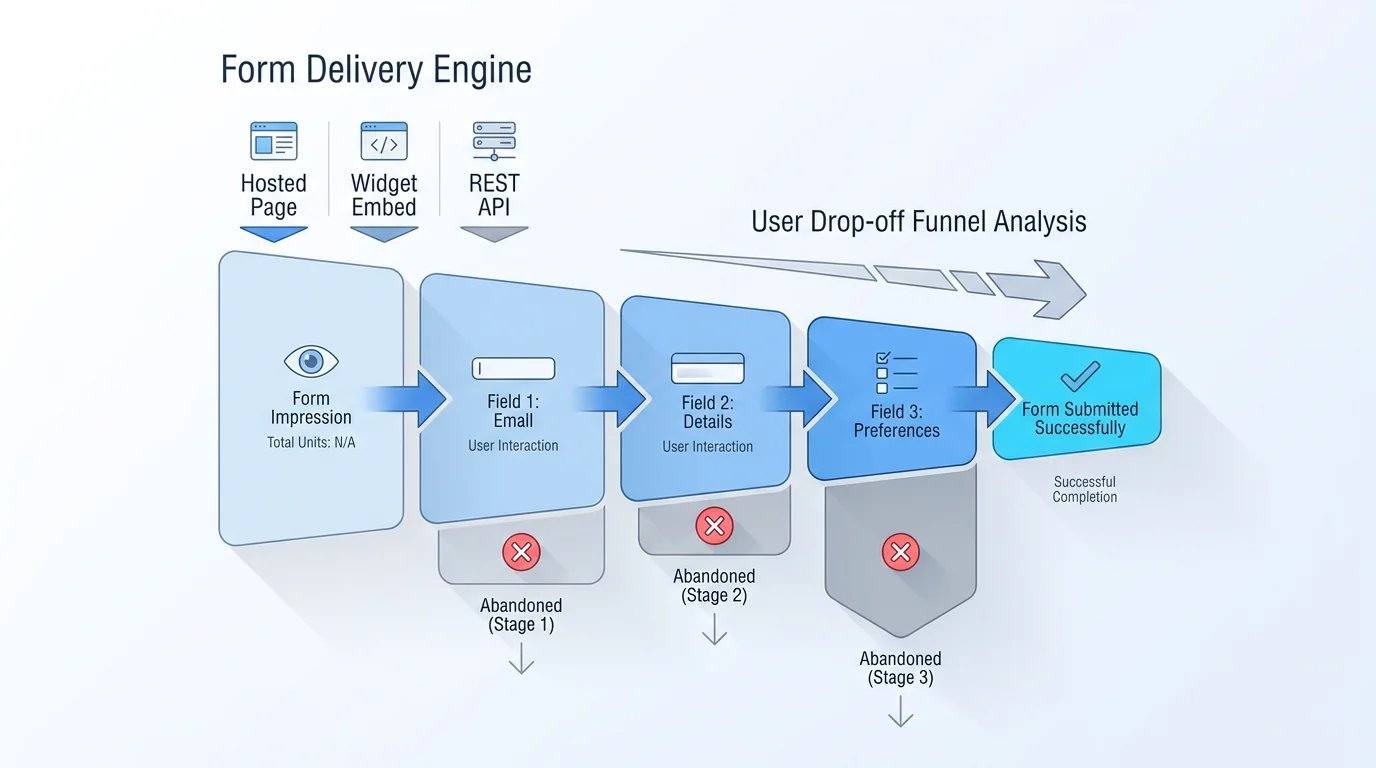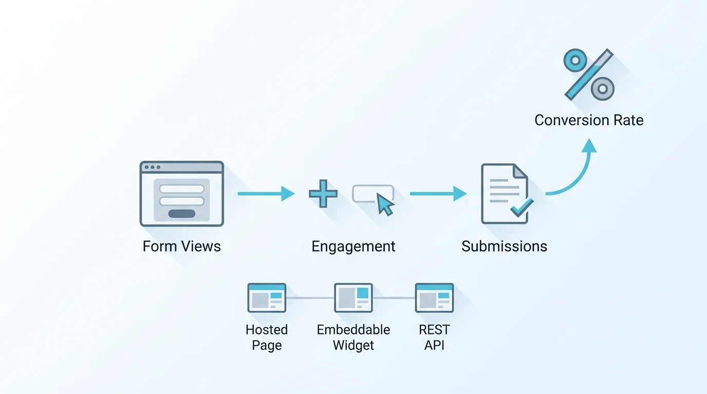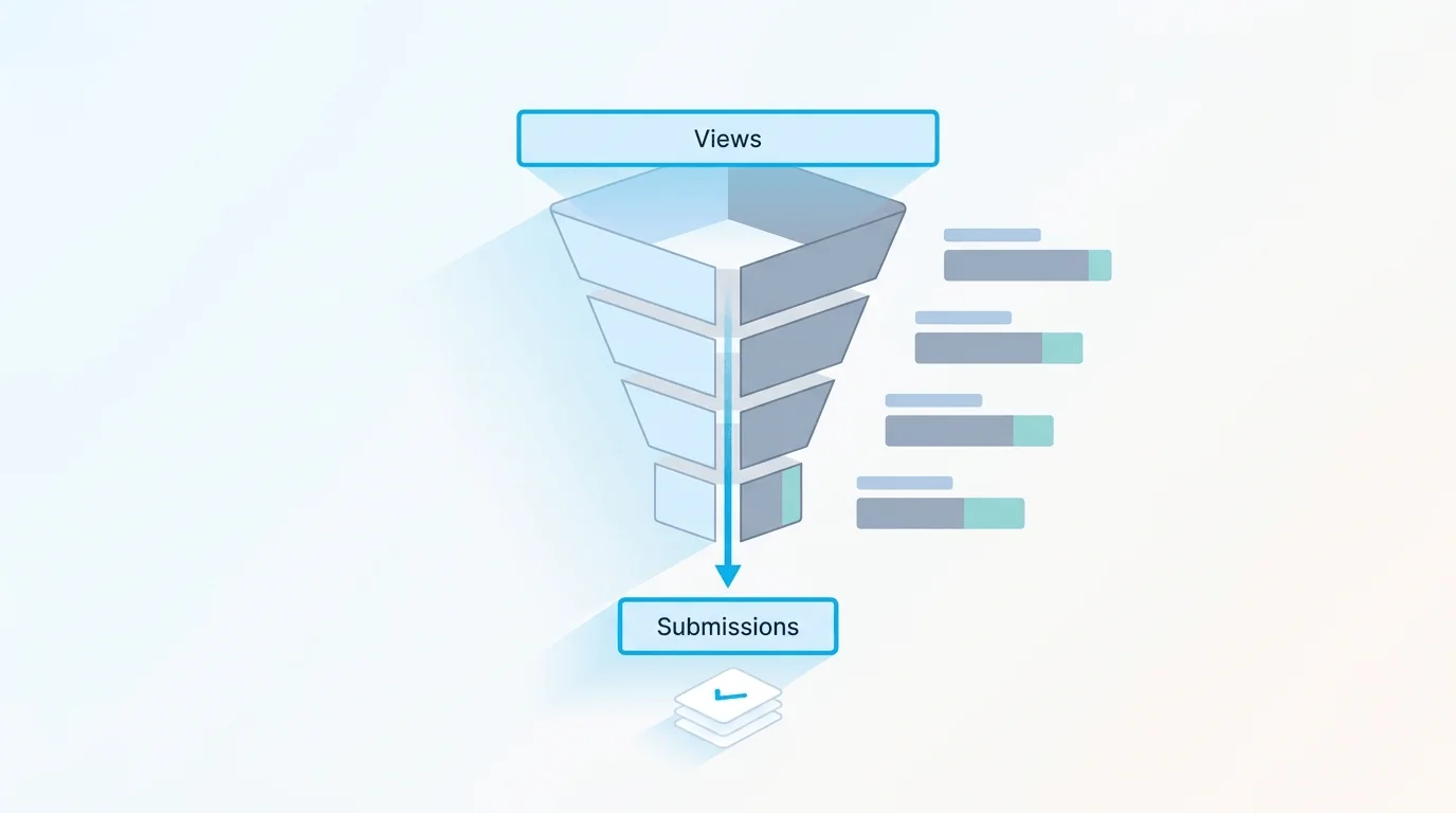
Open most form dashboards and the first number you see is a submission count. It is the easiest metric to compute and the least useful one to act on. A count tells you that 412 people finished. It says nothing about the 1,300 who started, the question that made 200 of them close the tab, or whether the people who did finish actually like you. The four views in this article — completion funnel, per-field stats, NPS, and geo/device — recover the parts of the story the count throws away.
The Count Is Not the Story
Counts are a lagging, lossy signal. They aggregate every cause into one figure, so a good week and a broken field both look like "fewer submissions." To improve a form you need the shape of the drop-off, not just its total: which step, which field, which audience, and how the finishers feel. Those are four distinct questions, and each maps to a specific view — a completion funnel, per-field statistics, an NPS rollup, and geo/device breakdowns. None of them can be reconstructed from a submission count after the fact, because the people who left never became a row in your responses table.
What's on Every Plan
A basic analytics overview ships on every plan, including Free. That covers the headline picture — submissions over time and the top-line numbers you check at a glance to confirm a form is alive and receiving traffic. It is genuinely useful for a quick pulse, and it is the right place to start. What it deliberately does not include is the diagnostic layer: the funnel, per-field stats, NPS, and geo/device views. Those answer why a number moved, and they live one tier up. The rest of this article is about that diagnostic layer and what each view actually tells you.
The Completion Funnel: Where People Quit
The completion funnel is the single most actionable view for a multi-step form. It shows how many people reached each step and how many advanced, so the drop-off appears as a visible cliff rather than a missing total. If 70 percent of the loss happens between step two and step three, you stop guessing and go read step two. This is the heart of form completion funnel analytics: you are not measuring how many finished, you are measuring exactly where the others stopped. Combined with multi-step layout and conditional logic, the funnel also tells you whether a branch you added is quietly costing you completions.
Per-Field Stats: Which Question Costs You
A leaky step still has anywhere from one to a dozen fields on it. Per-field form stats narrow the blame to the exact input. Within a step, one badly worded question, one over-eager required toggle, or one field people simply do not want to answer can drag down the whole page. Per-field statistics surface that field by field, so you can see the specific input that respondents skip, abandon, or stall on. The fix is usually small: make a field optional, rephrase a label, split a compound question. But you cannot make it until you know which of the 35 field types on the form is the culprit.
NPS: Turning a Score Into a Trend
Finishing a form and being glad you did are two different things, and a funnel only measures the first. The built-in NPS survey tool takes the classic 0–10 "how likely are you to recommend us" question and rolls the responses into a Net Promoter Score, tracked over time rather than read one response at a time. That trend line is the point: a single promoter is noise, but a score sliding three months running is a signal you can take to a roadmap. Because the survey is just another Forms Expert form, the same delivery and storage apply. Responses land in the dashboard and route to email, Telegram, or a signed webhook like any other submission.
Geo and Device: Who and How
Geo and device breakdowns answer the who and the how. If a form converts fine on desktop but collapses on mobile, that is a layout bug, not a copy problem, and a device split makes it obvious in seconds. Geo tells you where respondents are coming from, which matters when a campaign targets one region but the submissions arrive from another. Worth knowing where this geo data stops: it describes the audience hitting your form, and it stays in the analytics layer. The separate GDPR cookie-consent module logs each visitor's category choices but does not attach a country or region to those consent records, so do not treat the geo breakdown as a stand-in for the consent log.
The Pro Gate, Stated Plainly
Here is the line, with no soft-pedaling: the basic overview is on every plan, and the completion funnel, per-field stats, NPS, and geo/device views are Pro and up. They are part of the Pro plan at $29 per month and the Business plan above it. They are not on Free, and they are not on the $9 Starter tier. If the diagnostic layer is the reason you are evaluating analytics at all, plan for Pro. Paid plans include a 14-day trial, so you can run a live form through a real funnel before committing — which is the only way to know whether the drop-off view earns its place in your workflow.
| Analytics View | What It Answers | Available On |
|---|---|---|
| Basic overview | Is the form receiving submissions? | All plans (incl. Free) |
| Completion funnel | Which step do people quit on? | Pro and up |
| Per-field stats | Which field costs completions? | Pro and up |
| NPS | Are finishers glad they finished? | Pro and up |
| Geo / device | Who submits, and on what? | Pro and up |
No Export Step
A point worth stating because so many tools get it wrong: none of this requires exporting data to a spreadsheet or wiring up a separate analytics product. The funnel, per-field stats, NPS, and geo/device views are computed from the submissions already flowing through Forms Expert and rendered in the same dashboard where you build the form. There is no warehouse to feed, no tag manager to babysit, no nightly CSV. You ship the form from the home page builder, respondents fill it out across whatever surface you published, and the diagnostics are waiting in the same place — counts on every plan, the deeper picture on Pro and up.
Frequently Asked Questions
Every plan, including Free, comes with a basic analytics overview. That covers the headline picture: submissions over time and the top-line numbers you check to confirm a form is alive and receiving traffic. It is a useful pulse check and the right starting point. What the Free overview deliberately leaves out is the diagnostic layer — the completion funnel, per-field statistics, NPS, and geo/device breakdowns — which answers why a number moved rather than just reporting that it did. Those deeper views begin on the Pro plan. So the honest summary is that counts are universal, but the analysis that tells you where to fix a form is a Pro-and-up capability, not a free one.